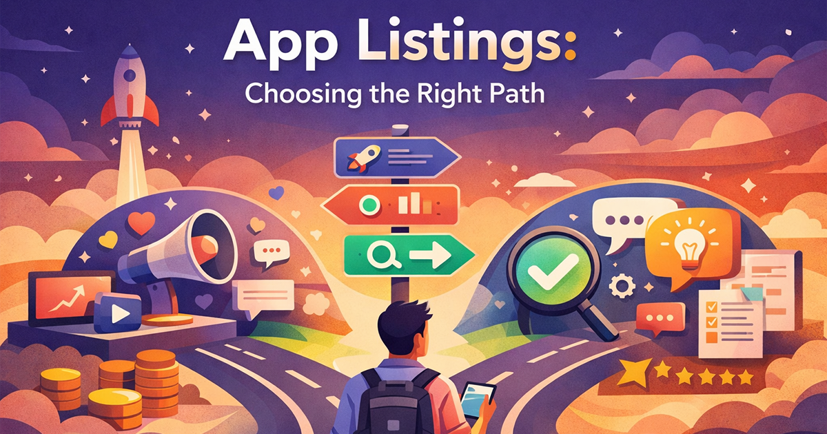
Where to List Your Indie App for Maximum Exposure
Most indie founders don’t struggle to find places to list their app. They struggle to decide which ones actually matter.
By the time an app is ready to be shared, the internet offers an overwhelming number of options—launch sites, directories, deal platforms, communities, marketplaces. Each promises exposure. Each feels like progress. And yet, listing everywhere rarely leads to consistent results.
The problem isn’t effort. It’s context.
Not every listing exists for the same reason, and not every audience arrives with the same intent. Some listings are designed to surface unfinished ideas to curious peers. Others are built to create a short burst of attention. A few are meant to help users discover tools at the exact moment they’re searching for a solution.
When those differences aren’t understood, listing decisions become arbitrary. Founders submit their app wherever they can, hoping something sticks. Sometimes it does. Often it doesn’t. And it’s hard to explain why.
This article looks at app listings from a different angle—not as a checklist of websites, but as decision points. It breaks down how listings behave, what each type is best suited for, and how to choose where your app belongs based on intent, not guesswork.
Before diving into specific platforms or examples, it helps to anchor on a few principles that shape every effective listing strategy.
Key Takeaways
- Not all app listings serve the same purpose
- Fewer, well-chosen listings outperform mass submissions
- User intent matters more than platform popularity
- Listings amplify clarity, not weak positioning
- Effective listing is a decision, not a checklist
Why Most Indie Apps Get Listed but Stay Invisible
Most indie founders don’t struggle with effort. They struggle with direction.
When it’s time to list an app, the default instinct is simple: submit it everywhere possible. Launch sites, directories, deal platforms, communities—each submission feels like progress. Yet outcomes are often unclear. Some listings bring a few visits. Others do nothing at all. Very few lead to sustained traction.
The issue isn’t that listings don’t work. It’s that listings don’t work in isolation.
Research on digital marketplaces and user decision-making consistently shows that visibility alone does not drive engagement. In crowded environments, users scan quickly, compare loosely, and ignore most options unless something clearly matches their intent. When too many similar choices appear without strong differentiation, the majority are filtered out almost instantly.
Research shows that large numbers of options only reduce engagement when differentiation and clarity are missing; well-structured, clearly distinct choices remain effective (Scheibehenne et al.).
Every listing places an app in front of a specific audience, with a specific mindset. Some users arrive casually. Others are comparing alternatives. Some are actively trying to solve a problem. When an app appears in a context that doesn’t match that mindset, it fades into the background—regardless of how many platforms it’s listed on.
This pattern aligns with broader findings in product-led growth and marketplace research: distribution amplifies positioning, it doesn’t create it. If the value proposition isn’t immediately clear—or the audience isn’t primed for it—additional exposure produces diminishing returns.
This is why many apps are technically “listed everywhere” but practically invisible. They’re present, but not aligned.
Visibility comes from contextual fit, not volume. When listings are chosen without regard to audience intent, results feel random because the decisions behind them were random. Before deciding where to list, it’s necessary to understand what role a listing is meant to play.
What “Listing Your App” Really Means Today
Being listed on the App Store or Google Play is a requirement, not a strategy. Every app starts there. What determines exposure happens beyond that baseline.
Today, listing an app is no longer about availability. It’s about placement and context.
Every listing places your app in a specific environment—next to certain alternatives, in front of a particular audience, and within a set of expectations that shape how users interpret what they see. Some environments invite exploration. Others encourage comparison. A few are optimized for quick, transactional decisions. The same app can feel compelling in one context and invisible in another.
Modern app ecosystems are crowded by default. Users don’t browse endlessly. They skim, filter, and move on. In that reality, a listing doesn’t persuade—it signals. It tells users who the app is for, what problem it solves, and whether it’s worth attention, often in just a few seconds.
This is why listings don’t create demand on their own. They don’t educate users or build trust in isolation. Instead, they amplify whatever clarity already exists. Strong positioning benefits from the right listing context. Weak positioning collapses under more exposure.
Seen this way, listing your app isn’t a distribution chore. It’s a decision-making exercise. The real question isn’t where can I list my app? It’s in which environments does my app immediately make sense?
Once you understand that listings behave differently depending on context and intent, it becomes clear why most “top app listing sites” advice falls short.
That’s what the next section addresses.
Why Generic “Top App Listing Sites” Advice Fails
Most advice about app listings starts from the wrong premise.
Search for “top places to list your app” and you’ll find long, familiar lists—directories, launch sites, marketplaces—often presented as universally useful. The implication is simple: more listings equal more exposure. But this framing ignores how listings actually work in practice.
The problem with generic lists isn’t that the platforms are bad. It’s that they’re treated as interchangeable.
Each listing environment attracts users with different intentions. Some users are browsing casually. Others are evaluating alternatives. Some are actively looking to solve a specific problem. When advice ignores these differences, it encourages founders to submit their app everywhere without understanding what outcome each listing is designed to produce.
This is why many founders feel disappointed after “doing everything right.” They followed the list. They submitted to reputable platforms. And yet results felt random. That randomness isn’t bad luck—it’s a consequence of mismatched context.
Generic listing advice tends to fail because it:
- Treats all platforms as equally effective
- Ignores user intent and audience mindset
- Assumes timing doesn’t matter
- Frames listing as a one-time task instead of an ongoing decision
- Explains where to submit without explaining what should happen next
Most importantly, these articles rarely explain why a platform should work. They tell you where to submit, but not what to expect once you do. Without that understanding, founders have no way to evaluate results or adjust strategy.
This is why effective listing strategies don’t start with platforms. They start with behavior—how different types of listings surface apps, how users interact with them, and what kind of momentum they create. To make better decisions, it helps to stop thinking in terms of websites and start thinking in terms of listing behaviors. There are three that matter most.
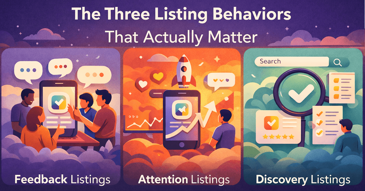
The Three Listing Behaviors That Actually Matter
Once you stop thinking about listings as websites and start thinking about them as environments, a pattern becomes clear.
Not all listings behave the same way.
Regardless of where they appear, app listings tend to fall into three distinct behavioral categories. These categories aren’t tied to specific platforms, and they aren’t tied to a timeline. They describe what a listing does once your app appears in front of users.
Understanding these behaviors matters more than memorizing platform names, because the same platform can behave differently depending on how and when it’s used.
In practice, these behaviors show up clearly: founder communities like Indie Hackers function as feedback environments, launch-driven platforms like Product Hunt concentrate short-term attention, and comparison or category sites like Capterra support long-term discovery when users are actively evaluating solutions.
At a high level, listings do one of three things:
- They surface your app to people who want to give feedback
- They generate a short burst of attention
- They help users discover your app when they’re actively looking for a solution
These behaviors are fundamentally different. They attract different audiences, create different expectations, and produce different outcomes. Problems arise when founders expect one behavior and get another.
For example, a listing designed to collect feedback won’t generate meaningful traffic. A listing built for attention won’t create long-term discoverability. And a discovery-oriented listing won’t feel impressive on day one.
Most disappointment around app promotion comes from this mismatch—not from the quality of the platform itself.
The sections that follow break down each of these listing behaviors individually, explaining what they’re best suited for, what they’re not, and how to recognize when you’re using the right one for the right reason.
Feedback Listings: Where Signal Beats Traffic
Feedback listings exist to answer a single foundational question: does this app genuinely work for the people it’s meant for?
These listings are not built for scale. They are built for learning. Traffic is limited by design, which is exactly what makes the signal valuable. Instead of chasing volume, feedback listings surface clarity—about positioning, usability, and real user expectations.
In feedback-oriented environments, users arrive with a different mindset. They expect early-stage products. They tolerate imperfections. More importantly, they explain their reactions. This creates a level of insight that analytics dashboards can’t provide.
“Early feedback doesn’t scale—but bad assumptions do.”
That’s why feedback listings matter most when product direction is still fluid. They help founders refine messaging, validate assumptions, and avoid amplifying the wrong narrative later.
What these listings don’t do is generate momentum. They are diagnostic, not promotional. Treating them as growth channels leads to frustration and misread results. Their value lies in better decisions, not bigger numbers.
Used correctly, feedback listings sharpen strategy before exposure multiplies mistakes.
Attention Listings: Launch Visibility Has a Half-Life
Attention listings are built for speed.
They concentrate visibility into a short window, placing your app in front of a broad audience in a compressed timeframe. For indie developers without an existing following, this often feels like the first real moment of exposure.
The spike is real—but temporary.
Attention-driven environments rely on novelty. Once the listing is no longer new, visibility drops sharply. This isn’t a flaw in the platform. It’s how attention economics work.
An attention listing succeeds when it:
- Introduces the app to people outside the founder’s immediate network
- Creates early awareness and social proof
- Tests how unfamiliar users interpret the app’s value
It fails when founders expect it to generate sustained growth on its own.
Attention listings are not meant to replace discovery or retention. They function best as entry points, not destinations. Without a follow-up path—whether through discovery listings, content, or owned channels—visibility fades and momentum resets. For founders evaluating deal-based launch platforms, we break down when they help—and when they backfire—in Best AppSumo Alternatives for Indie Developers (2026).
Discovery listings operate on a different timeline. Instead of short-lived spikes, they create compounding exposure, allowing your app to be found continuously by users already searching for solutions.
Because intent is higher, user behavior changes. Visitors arrive with context. They’re problem-aware. They’re closer to decision-making. This often leads to better conversion quality and stronger long-term engagement.
The defining characteristic of discovery listings is durability. A well-positioned listing can continue driving qualified traffic long after publication. Growth is slower, but it’s predictable and cumulative.
“Spikes feel good. Discoverability pays the bills.”
This is where many indie apps either stabilize or stall. Discovery rewards clarity. Apps with a clear use case and positioning benefit over time. Apps with vague messaging struggle, regardless of exposure volume.
The challenge is patience. Discovery rarely feels successful in the short term. There’s no visible surge to validate the effort. Results appear gradually, often after weeks or months.
Founders who understand this dynamic don’t abandon discovery—they let it mature. Attention gets your app noticed. Discovery keeps it findable.
How These Listing Behaviors Show Up in the Real World
Here too, differentiation matters—but not as a single headline or feature list. In discovery-driven environments, clarity has to show up everywhere.
It starts with the first exposure: the screenshot, the title, the one-line description. If a user can’t immediately tell why this app exists or what it does differently, they move on. No matter how strong the product is underneath, discovery never gets a second chance to explain.
Research on choice overload shows that when users face many similar options, motivation and engagement decline unless clear differentiation helps guide decision-making (Katz et al., 2006).
That same clarity has to carry through the experience. The features you highlight, the examples you show, even the way you ask for feedback all reinforce the same idea: this app solves this problem in a way others don’t. Even in crowded niches, there are always edges—small workflow improvements, missing features, simpler setups, or a clearer focus that competitors ignore.
When that uniqueness is consistent, discovery works the way it’s supposed to. Over time, users who are searching for exactly that solution begin to recognize it. When it isn’t, listings may still generate impressions—but the app remains invisible in practice, blending into everything else around it.
Discovery doesn’t reward novelty alone. It rewards coherence. The same unique point, expressed clearly at every touchpoint, is what allows an app to separate itself—even when listed alongside dozens of similar tools.
| Listing Moment | What the Listing Is Doing | Where Uniqueness Must Show Up | What Happens If It Doesn’t |
|---|---|---|---|
| Initial Exposure | Introducing the app to a new audience | Screenshot, title, one-line value proposition | The app blends in and gets skipped, even if listed correctly |
| First Click | Convincing the user to explore further | Description framing, use-case clarity, positioning | Clicks drop because nothing feels distinct or relevant |
| Comparison Phase | Being evaluated against similar tools | Highlighted features tied to a specific problem | App feels interchangeable with competitors |
| Post-Listing Feedback | Gathering reactions and reviews | How feedback questions are framed around the unique angle | Feedback becomes vague, scattered, and unhelpful |
| Repeat Discovery | Appearing again in search or curated views | Consistent message across screenshots, text, and updates | Users see it again but don’t recognize or remember it |
Finding Your Edge in a Crowded Listing
When founders hear “differentiate,” they often assume it means inventing something entirely new. That’s rarely the case—and it’s why many apps sound generic even when they’re well-built.
In crowded listings, differentiation usually isn’t about what the app does. It’s about which problem it commits to solving—and which ones it intentionally ignores.
One way to find that edge is to look at who your app works best for, not who it could theoretically serve. Most tools try to appeal broadly. Clear apps choose a narrower audience and speak directly to them. An app that’s “good for everyone” rarely stands out in a list.
Another place to look is friction, not features. What part of the workflow do users complain about most when using alternatives? Speed, setup, pricing complexity, learning curve, integrations, trust—these pain points are often more differentiating than feature depth. An app that removes one specific frustration can feel meaningfully different, even in a saturated category.
Sometimes the edge is context, not capability. The same functionality can feel new when it’s framed around a clearer use case. Instead of “a task manager,” it becomes “a task manager for async teams” or “for daily planning, not long-term projects.” The product hasn’t changed—but its relevance has.
Finally, differentiation often shows up in language before it shows up in code. The words used in screenshots, descriptions, and onboarding shape how users categorize the app. When that language reflects a specific problem and outcome, the app becomes easier to recognize—and harder to confuse with everything else.
You don’t need a revolutionary feature to stand out in a listing. You need a consistent point of view—one that shows up the same way in screenshots, descriptions, examples, and even the questions you ask users for feedback.
Listings don’t reward apps that try to be everything. They reward apps that are clearly something.
Where AppDovo Fits in This System
This is where platforms like AppDovo naturally fit.
AppDovo isn’t meant to replace early feedback environments or long-term discovery channels. It operates in the space between them—where initial attention needs a place to continue, not fade.
By listing apps in front of users who are already browsing for deals and new tools, AppDovo helps founders turn short-term exposure into repeat visibility. Attention doesn’t end after a single moment. It has a path forward.
Used as part of a broader listing strategy, AppDovo supports both early visibility and ongoing discovery—without relying on one-off launches or constant re-promotion.
If your app is ready to move from attention into discovery, you can submit it to AppDovo and reach users who are actively looking for new tools and offers
Why This Matters More in 2026
What makes these listing dynamics more important in 2026 isn’t a single new platform—it’s volume.
AI tools, templates, and no-code frameworks have made it dramatically easier to ship software. More apps are launching faster, with fewer visible differences on the surface. As a result, discovery environments are more crowded, attention windows are shorter, and users filter more aggressively.
As a result, success today depends less on what tools you use and more on when and how you approach promotion across each stage of your app’s lifecycle.
In this landscape, listings don’t have more power—they have less tolerance. Apps that lack clear positioning are ignored faster. Apps that communicate their value immediately are rewarded more consistently. The mechanics of listings haven’t changed, but the margin for ambiguity has disappeared.
That’s why understanding how listings behave—and choosing them deliberately—is no longer optional. It’s the difference between being present in the ecosystem and being noticed within it.
Final Thought
Listings don’t create success. They reveal it.
Every listing—whether for feedback, attention, or discovery—amplifies the same thing: how clearly your app solves a specific problem differently than the alternatives. When that uniqueness is missing, listings don’t fail silently—they simply expose the gap faster.
That’s why effort alone isn’t enough. An app can be listed in the right places, at the right time, and still disappear if it sounds like everything else around it. Feedback becomes vague. Attention fades quickly. Discovery never compounds.
When the unique value is clear—shown consistently in screenshots, descriptions, features, and even the way feedback is collected—listings start working as intended. Each environment reinforces the same idea instead of sending mixed signals.
Successful indie promotion in 2026 isn’t about being everywhere.
It’s about being distinct, consistently, wherever you appear.
Listings don’t fail apps.
They expose whether the app gives users a reason to choose it.
And that’s the difference between being listed—and being remembered.


